Wednesday, 17 August 2011

Double page spread .

Hey there , this is one of my most recent projects , We where asked to do an Illustration for a double page spread ,we where each given a five different articles and had to choose one . I decided to do one called Man Must Wack , It is an article based on Durban and almost its grungyness  as a city. It made me smile when I read it , and I wanted to focus most of my work on a South African feel. we also had to choose a magazine for the spread to go into, I choose Design Indaba. It a pretty cool , South African design mag , with simple yet effective layout. So here is my work , Enjoy peeps :) 

This is the illustration.


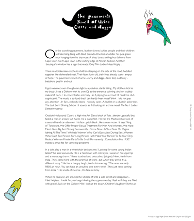
Page one of the Double page spread , I kept it clean and simple .


This is the 3rd page , still keeping it simple.
Hope you all enjoy :) 


Fast food packaging design.

For this Brief , we had to choose between redesigning fast food packs in a more eco-friendly way or 
design a pack to fit five doughnuts  into. I choose to redesign The Nandos packaging.
My concept was that with each burger combo deal , you would receive a packet of Peri-peri seeds,
which you could then take and plant into your Box( which looks like a chicken ). The concept for me was to make the pack reusable. So plant your seed and spread the love :) 


This the poster for the campaign.


This is the seed packet you will receive.


This is the burger box , The wings are cut out and the feet , so it looks like a chicken :)


This is the cup sleeve , the wings are also cut out .


Here is the chip packet , the feet stick out , it quite funny :) 


Ijusi, Typografik Africaka vol 3

This was a project that we did with Garth Walker of Mister Walker Designs.
We where each asked to design a type that was based on something unique to South Africa.
I choose to design my font on the flyers that are very common in Durban, Dr Jumba flyers , that can cure 
and heal any sexual problem. only a few students where selected to be published in The Jusi, TypoGrafika Afrika Vol 3 . My outrageous font was one of them .


here is the flyer :)

This is a rough sketch of the font 


The lectures asked us to do a double page spread for them , as to show where we
got our inspiration from .


Here is the final piece that was selected for Ijusi. 
Hope you enjoy it , pigeon girl .


Wednesday, 15 June 2011

Photo assignment

The concept of this brief was to take a lyric from a song and turn it into a image.
I choose rolling stones , Paint it Black . I shot this in my Garage with a good friend as my model and had lots of fun .

First image in paint it black series 
Image two  in paint it black series 
Image 3 in series 


Save vetchs Corp Campaign

Here is some logo development for Durban paddle ski club
This is the final logo I choose
 Logos for save vetchs beach , I like cutesy creatures :)


Layout of all components , letterhead , comp slip and bus card 


Homepage of website 


Campaign page of website


postcards for save vetchs beach campaign 


T-shirt's for Save Vetchs sponsored by Durban Paddle ski club 


Thursday, 2 June 2011

I love this stuff

I thought id show you guys just a few things that make me happy 

Friday, 6 May 2011